Looking for ideas on a new page (again for the kx.studio site).
If you look at https://kx.studio/Development it should be pretty clear what it tries to do.
But well, it looks horrible 😅
Suggestions will be very welcome!
PS: the page might take a tiny bit to load
@falktx I'd say, just make the changes/commits bigger easier to read. At the moment, the bold white font and the blue color mmake it really difficult to read what's been done.
make the change bigger, tune done the metadata and it will be much easier to read
@openmastering @falktx Yea, same idea here. Just make the _what_ you did on _which_ project easier to read. And if you can, remove the "Signed-off-by", it has no real informative value in my opinion. One line: "<timestamp> <project/repository name>: <commit message>" and on the next line, in smaller more dim font the "by <person>" - or something like that.
@openmastering @falktx Oh, and if you reduced the number of displayed lines like that, you can increate the font size a little, especially the one of the commit message.
@weirdconstructor @openmastering all those make sense, thanks.
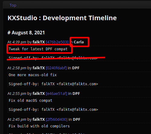
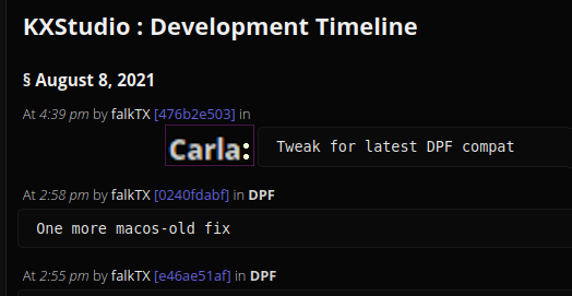
adjusted the page a little bit, but still not optimal. the project name needs to be more pronounced..
@falktx @openmastering Maybe make the name bigger, and think about a two column/flexbox layout?
@weirdconstructor if going that way, I would rather group projects together per day, so it doesnt say in big fonts the same thing over and over again.
That will need some more smart code than what I have now, but it should also work, right?
@falktx yea of course, was just meant as inspiration! 😄

@falktx some styling to make the boundaries between different commits more apparent may help