

falktx @falktx@mastodon.falktx.com
@tromino ah yes, true. I will open a ticket about this so I dont forget.
this is quite the minimal compared to other issues, but still, thanks for bringing that up.
@tromino not really sure how that works...
so ardour has its own set of plugins that can be installed for it? because if/when other daws have different library versions, this will require alternative versions of these plugins as well.
there are a LOT of sorta-duplicated-but-not-really binaries of plugins and libraries...
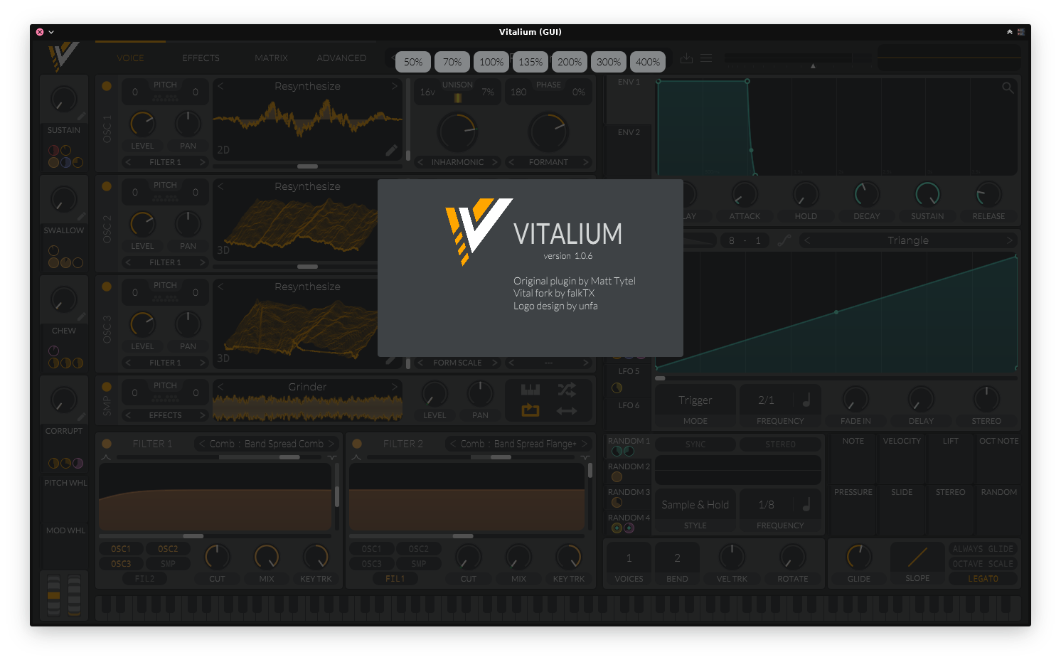
@tromino not sure what you mean.. the logo being bigger than the text in the about page is an intentional visual/design choice.
@tromino audio plugins in flatpak cant really be a thing unless tied to the same libraries as the ones used in the host.
@be I like that wording! will change to that
@unfa could I ask for some testing? you are used to this synth as you used it before. this one is too complex for me to assess if it is working correctly or not.
@reiso I agree the colors stand out a bit, so they do so as well in the original. I am trying to not change too much. The pink to orange conversion makes sense as default color change, for anything else I am not so sure...
@unfa no, this version will have no online features at all. I will change icon->logo, thanks
@nihilazo nothing, it is rather the contrary. original has trademarks plus authentication and other stuff that linux distributions are not allowed to use. so an alternative to the original is needed. the default color being different makes it clearer that this is a fork and not original.
@hoergen the vitalium version not just has a different name, but it uses a different config folder.
I am going to tweak the colors a bit so it is more clear when you look at official vital or the forked version.
on surge, it is on my todo
Another one of those monthly reports :)
https://kx.studio/News/?action=view&url=kxstudio-monthly-report-february-2021
February went by way too fast...
@ilvipero good idea. I do not think I can take new feature requests at this point, as there is a whole lot of stuff I want to get finished first, but something to revisit and start planning for in April. I will add this to the backlog, thank you!
@reiso I see, thanks for the input. I have used trello maybe once in my life, so really not used to what colors are often picked for what things.
I will see about adding some header or footer notes about what each color means. can simply be another todo item there :P
@reiso well, my overall idea is..
yellow: packaging stuff or related to kxstudio repositories
orange: articles or things to write (usually releases or news)
green: coding task which is similar to something I did before, so "easy" to do
red: bugfixes
blue: porting over something that already exists/was done before. involves boring, copy, paste & adjust work
pink: brand new projects or things to do, which usually involve learning, research, testing, etc. can take long.
does that make sense?
@be that is sorta the idea, as likely monthly updates might be too spread out and too few.
that said, writing about current progress also takes time, sometimes from the actual work in question.. so there is a balance to achieve here, I think.
Currently testing making public my current FLOSS work status, with a kanban-style board. Not just to make others aware of short/medium-term plans, but also things that are currently being worked on behind the scenes that usually are not seen until a big flashy release.
What do you think?
https://board.kx.studio/
